When trying to flip a complex system, a huge part of the work is communicating the motivation of the change to other people. Vision statements and process models are great tools for communication but sometimes a visual representation of your data set could be more powerful. If you’re trying to convey the meaning of your data but are stuck in an excel rut, then this is the post for you.
I completely empathize with wanting to learn more about a particular topic, typing a keyword into your search engine and then becoming overwhelmed by all of the resources out there. While it is amazing to have choices it’s not so great for taking action, especially if you have no idea where to start. Here are 6 ways to learn some of the basics and get an idea of what’s out there before exploring further in a particular direction.
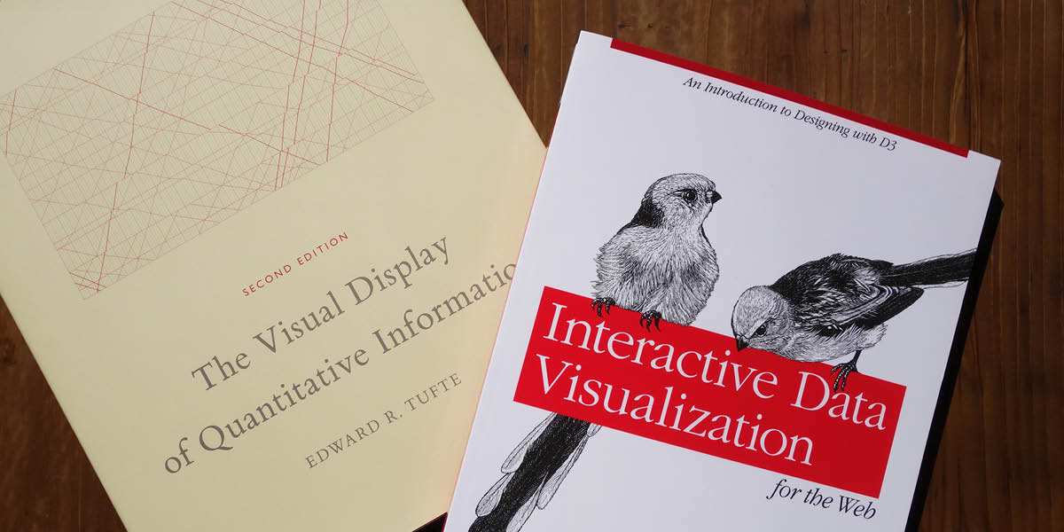
1. Read a book about data visualization
Check out “The Visual Display of Quantitative Information” or “Envisioning Information” by Edward Tufte. Some of the tips and examples are a little dated but there are still plenty of core visualization themes that are timeless. It’s time to brew some tea and curl up with some charts and graphs.
2. Visit blogs and websites for inspiration
Check out Information is Beautiful, follow the New York Times graphics department on twitter, or read some articles on National Geographic’s Data Points. Reflect on what causes visuals to resonate with you vs. which ones you gloss over. What are their strengths and weaknesses?
3. Explore what’s possible with a little coding
Check out D3 or Fusion Charts for examples. Excited yet?
4. Play with quick-start tools if you’re not quite ready to code
RAW is a great resource if you’re excited about the possibilities of D3 but don’t want to (or have time to) dive into the details just yet. It’s built on DS.js and offers a limited set of graphs to choose from but you could always export your visual as a svg or json and tweak it further if you would like. Tableau Public and Datawrapper are also great tools.
5. Complete a few exercises to learn D3
While there are a ton of great tutorials and courses out there for D3 I found the book “Interactive Data Visualizations for the Web” to be helpful for relative beginners. It guides you through exercises to gradually build up your understanding and skills. I like how each chapter essentially breaks down into a learning module so you could complete a chapter every few days or every week as your schedule allows. This book won’t teach you everything but will give you a good enough understanding to dive into more of the D3 tutorials afterward. If taking a course is more your style and you have some coding experience, check out this Udacity course.
6. Listen to a data visualization podcast
I’ve gotten really into podcasts lately and they are a great way to be introduced to new ideas, people, and companies while doing otherwise monotonous tasks like commuting, running, or cleaning. Most of the Data Stories episodes involve conversations between professionals in the data visualization field, which I find interesting because you get to hear about their lessons learned and reactions to data visualizations they’ve seen. It’s kinda like listening to the judges on Top Chef. You might not recognize or understand all of the terms, but it makes you want to go to the kitchen and cook something. If you’re a beginner I recommend checking out episodes such as #35 “Visual Storytelling w/ Alberto Cairo and Robert Kosara” or #52 “Science Communication at SciAm w/ Jen Christiansen.”
I hope this short list of resources helped to narrow down some of the options out there. If you’re not sure where to start, try starting with #1 and working your way down the list in order. Let me know how it goes!
Of all of our inventions for mass communication, pictures still speak the most universally understood language.
– Walt Disney