

If you’re trying to improve a complex system, business, or product, you probably have a backlog of items you want to work on. Requests that came from users, stakeholders, partners, or team members. Incoming initiatives or mandates. Progress down roadmaps, maintenance items, research, experiments, or infrastructure work.
In a perfect world, items would just fall into your backlog with consistent details and a clear owner. You’d be able to quickly prioritize them by value and complexity and get moving.
Reality is usually less pretty.
Your backlog is more likely to include items of different sizes, value, and level of detail. Some may be connected to well-known processes. Others might be completely new. You could be working with a one-line description or a detailed set of documentation. The item could involve collaborating with a brand new partner. Or one you’ve known and worked with for years.
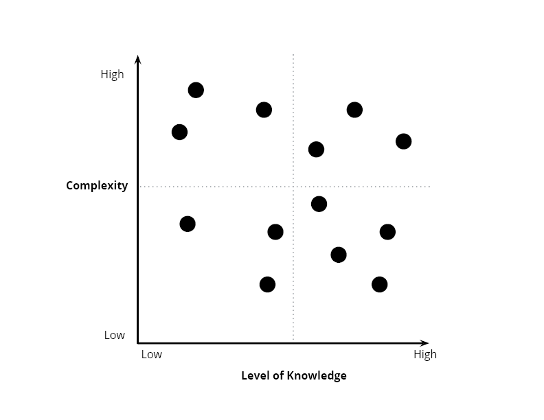
Plotting the items by value and complexity can help determine what to focus on. However, there’s another dimension that can make all the difference: your level of knowledge related to that item.
If you have a low level of knowledge about an item, then there are a lot of unknowns. There’s less certainty around the value, complexity, and risk of that item. In contrast, an item with a validated problem, that’s part of a well-known process, for a familiar customer, would be better understood. If you also have a detailed design (or a few) that you’ve validated, then that item will fall on the high end of the knowledge spectrum.
Building a Complexity vs. Level of Knowledge chart
Your backlog also represents the portfolio of work you’re investing analysis resources in (or considering investment in). For a different view, try plotting the items on a complexity vs. level of knowledge chart. Stick to under 10-20 items to keep the focus on work that’s in progress or on deck.
 This visual can help you:
- Identify who should own which items and where coordination is required (if you have a team of analysts involved).
- Communicate to stakeholders and team members why your approach for some items is different than others.
- Start a discussion with stakeholders and team members about why some items are moving to implementation more quickly than others.
- Lower the risk of releasing low value or detrimental changes.
- Align resources to balance your portfolio and maximize flow.
Determining the level of knowledge
To determine the level of knowledge you could use a simple metric, like how far along you are in the Enterprise Design Sprint list of activities. The more sections you complete and the more information you have about each section, the higher your level of knowledge. There’s no need to determine an exact number here, just a relative difference between the items you’re comparing.
Create your own list of criteria to represent the knowledge that you’d need about a change. You can probably map it directly to steps or deliverables in your process.
Here are some sample areas to consider when creating your knowledge checklist:
- Identified the:
- Problem statement & root cause
- Users impacted
- Stakeholders impacted
- Success criteria
- Assumptions to test
- Modeled the:
- As-is
- Business process
- Customer experience
- Technical state
- To-be
- Business process
- Customer experience
- Technical state
- As-is
- Conducted gap analysis between the as-is and to-be states
- Created a roadmap (identifying which roadmap this fits into, or creating one for this initiative from scratch)
- Validated as-is and to-be assumptions with:
- Users
- Business stakeholders
- Technical partners
- Executive decision makers
Note: Be careful about any items that have a detailed design but no clear problem statement, root cause analysis, or reference to the target customers or processes. That could be a sign that the problem space wasn’t evaluated enough before moving into design. In that case, the detail is deceiving because it could be a solution for the wrong problem. Mark those as relatively low knowledge, to represent that you need to back to the beginning of the process to validate needs.
Interpreting the chart
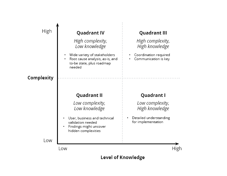
Once you plot everything out and are happy with the relative placement, you’ll notice that the items will fall into one of four quadrants:
Quadrant I) Low complexity, High knowledge
These are the relatively simple changes that require less time, people, and resources to implement. A lot is already known about the problem, its root cause, and the process it sits in. Or you have confidence that the team and owner assigned can quickly figure it out. If you’re using a scaled agile methodology, these items will most likely go to an agile implementation team.
Quadrant II) Low complexity, Low knowledge
These are items that seem simple, but could be deceiving. Root cause analysis and process modeling could reveal that the item truly is low complexity. On the other hand, the simple request could be related to a much larger and ambiguous problem. You could also learn that this change is part of a relatively clear solution, but requires coordination with multiple groups to implement it.
Quadrant III) High complexity, High knowledge
These are items that require a lot of players to execute but it’s relatively clear what you need to do, why, and who will do the work. In this case, it mainly requires coordination. Depending on the number of partnerships, the teams can coordinate themselves or you might need someone in an overarching role to support the coordination and alignment of requirements and roadmaps.
Quadrant IV) High complexity, Low knowledge
These are items that you know very little about but you know will be complex. Anything with a brand new partner, multiple teams, new initiatives, or new customers will fall into this area. It makes sense for a team operating at a more strategic level to own these items. That way they can do a first pass of the customer and business needs and provide some more clarity around an initiative. These initiatives are more likely to require roadmap alignment anyway, so pulling in implementation teams too early could take time away from other initiatives that will get out the door faster.
Upgrades
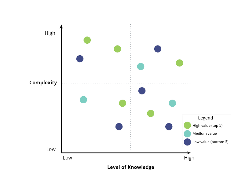
You could color code your items to indicate value, customers impacted, product lines, themes, etc. This overlay could be really insightful for balancing the portfolio of work your analysts take on. For example, if all of your high-value work requires coordination, but you’re not investing time and energy there, then you might need to reevaluate your staffing. We’ll talk more about use cases for this chart in the next section.
Using the chart
With analysts
This chart can be very effective for dividing up work among teams, analysts, or product owners/product managers/portfolio managers. (Replace these words to match how your project splits up analysis ownership.)
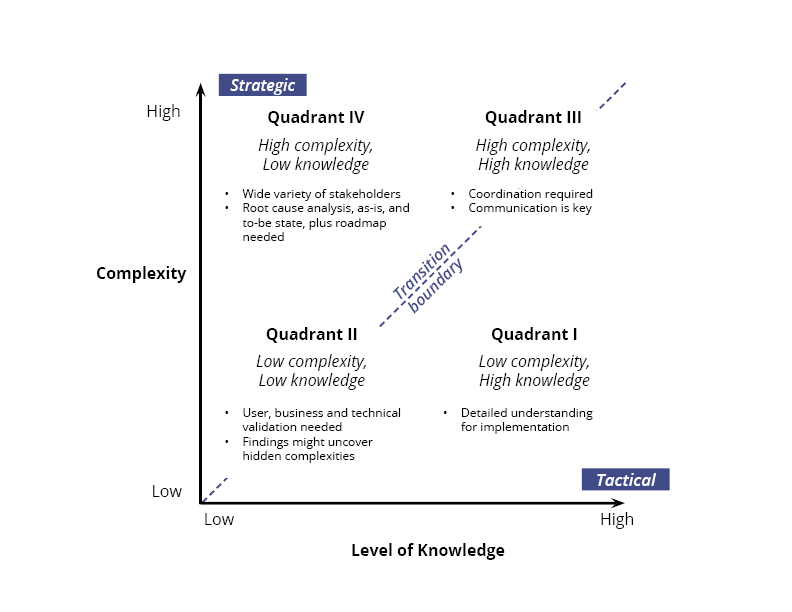
Tactical analysis
Items in Quadrant I are ready for the implementation teams to pull into their backlogs and roadmaps. You can point new team members to the existing knowledge base. Other team members will require less ramp-up time if it’s part of a product or process they already know well.
Transition boundary
Items in Quadrants II and III sit on a transition boundary between tactical and strategic. They either (a) seem simple but are not well known, or (b) are highly complex but clear. To handle these items, you might want to try different strategies for each analyst.
A stronger analyst could probably handle a simple (but not clear) item by himself, escalating any issues if needed. Someone with less context or analysis experience might benefit from working with someone at more of an architecture level. Someone with cross-cutting experience can help fill knowledge gaps and point out issues.
For items that are complex but well-known and require coordination, you’ll want people at both the strategic and team level involved. You can use the number of partners as a guideline. If the change requires less than 3 teams or partners then the team could own the coordination. If it involves many external partners, including some new ones, executing work over a long time period, then it may make more sense for a Product Manager or Portfolio Manager to take the reins.
Strategic analysis
Items that fall into the high complexity, low knowledge realm will probably require an exploration period before more decisions can be made. Depending on the timeline, topic, and time required, you might want to pull in some people from the implementation team. For example, you could hold a brief meeting or conduct an Enterprise Design Sprint. These can be good opportunities to pull more advanced analysts up. If you have a good mechanism for tracking and sharing notes, including being clear about hard and soft constraints, then it’s probably fine to not include analysts from the teams yet until things move further along. The choice will come down to the opportunity cost (ie. if the knowledge transfer is more valuable than alternative activities the team would have spent that time on).
With stakeholders
You can also use this chart to communicate with stakeholders who have an interest in seeing a particular item implemented. It can be especially effective for explaining why certain items aren’t moving through the analysis pipeline as quickly as others.
For example, if something is not moving into the team level because of the level of complexity and lack of understanding involved, that’s a hint to stakeholders that you need more information from them. If something’s stuck in the coordination quadrant, then you probably need an owner or champion to set up meetings, align priorities, and remove roadblocks. Otherwise, everyone should expect items in the lower half of the chart to move through the cycle fastest, with the items in the lower right corner being the most likely to be ready for implementation.
With managers
Reviewing this chart with managers can also help you make sure that you’re balancing the portfolio and aligning resources to the work that should be accomplished. That includes time, people, money, and expertise. So this chart can also have an impact on staffing and training decisions.
The daily work and in some cases the expertise you’ll need on your team will be different depending on which quadrant the item lies in. Quadrant I is ready for implementation teams, Quadrant II requires analysts, Quadrant III requires managers and partner coordinators, while Quadrant IV requires systems thinkers and architects.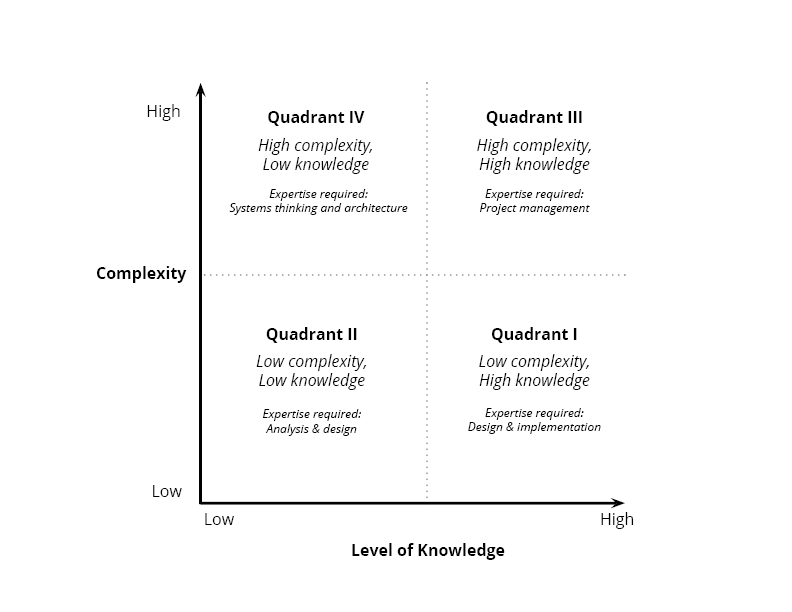 If you’re not prepared to handle all four quadrants then you’re severely limiting the challenges your team is prepared to tackle. Since items generally move from the top left to the bottom right, without all quadrants in place you might not have the resources you need to continuously create a backlog of highly valuable items, that are ready for implementation.
You’ll want to continually evaluate where the dividing line is for different members of the team. Some people may be equally successful in all quadrants, while others may have stronger skills or preferences for a particular quadrant.
Rotations and training can help fill skill gaps. Over time, you may want to stretch the abilities of individuals to handle more complex and ambiguous problems, while also balancing for the time and quality required. The tools on this site can help you and your team members break down complex and ambiguous items faster.
Sometimes just a different view of your portfolio can be what you need to identify issues and align expectations. What kinds of visuals have you found to be effective?